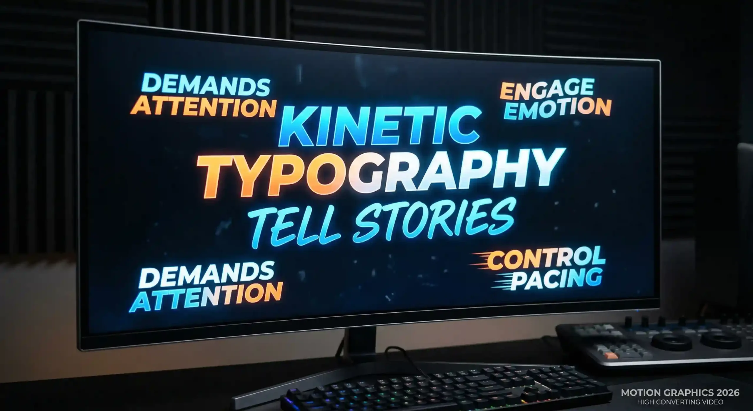
Text on screen used to just sit there. Static. Lifeless. Waiting to be read. Not anymore in 2026. Watch any modern commercial, social media ad, or brand video and you’ll see text that moves, scales, rotates, pulses – animated text that demands attention rather than hoping for it. That’s kinetic typography, and it’s completely changed how brands communicate visually.
Moving text is a storytelling tool that guides emotion, controls pacing, and ensures your message actually lands. When done well, kinetic typography makes the difference between content people scroll past and content they actually remember.
Professional motion graphic design services understand this shift. Let’s break down why and how to use it effectively.
What Is Kinetic Typography and Why Does It Matter?
Kinetic typography is exactly what it sounds like – text that moves. But it’s way more than just sliding words across the screen.
It’s about manipulating scale, rotation, speed, position, opacity – turning simple letters into expressive visual elements. Text that grows to emphasize importance. Words that shake to convey urgency. Letters that fade in slowly to create anticipation.
In modern video production through 2D and 3D animation services, kinetic typography serves multiple purposes. It reinforces spoken words, carries information when there’s no voiceover, guides viewer attention, and creates rhythm that matches the mood you’re trying to create.
The visual communication power of animated text comes from its ability to show meaning. The word “CRASH” appearing suddenly with impact animations feels different than it sliding in gently. Same word, completely different emotional response based on the text animation approach.
Capturing Shrinking Attention Spans on Social Media
Scroll through Instagram or LinkedIn and you’ll notice most people watch videos muted initially. No sound. Just visuals.
That’s where kinetic typography becomes essential for short-form video. Bold, dynamic text overlays communicate your message even when viewers can’t hear the audio. The first three seconds need to hook them, and moving text does that job exceptionally well.
Commercial video production companies building content for social platforms know this reality. Text needs to be large, high-contrast, and animated purposefully. Subtle fades don’t work when competing for attention. Sharp entrances, clear messaging, and confident movement do.
The beauty of text overlays for muted viewing is they eliminate the need for viewers to turn sound on just to understand what you’re offering. Your key message hits immediately through visual text, and if they’re interested, then they might unmute for details.
Amplifying Audio: Perfecting Podcasts and Interviews
Audio content has one major problem for social media – it’s invisible. A static waveform doesn’t exactly grab attention when scrolling.
Audiograms solve this by transforming audio into visual content using kinetic typography. The most impactful quotes from podcasts or interviews become animated podcast snippets with text that syncs to the speaker’s voice.
Working with a podcast production agency that understands text animation means your long-form content becomes shareable visual assets.
The text animation here serves dual purposes. It makes silent scrolling effective by showing what’s being said, and it adds visual interest that static imagery can’t provide. Audiograms with dynamic typography perform significantly better than static quote cards.
Guiding Emotion Through Typography Pacing
Fast, jagged text creates urgency and energy. Words that snap into place quickly feel exciting, maybe even aggressive. This works for action-oriented messaging, limited-time offers, or high-energy brand content.
Slow, smooth fades evoke calmness and contemplation. Text that gently appears and lingers feels thoughtful, premium, maybe even emotional.
Professional video editing services understand typography pacing as a tool for emotional storytelling. They match text animation speed to the mood, using rhythm to guide viewer emotion without relying solely on music or voiceover.
The transitions between text blocks matter too. Abrupt cuts feel different from smooth crossfades. Each choice communicates something subtle about tone and intent.
Blending Text with Live-Action Corporate Footage
Kinetic typography works brilliantly in corporate messaging when integrated with actual footage rather than existing on its own.
Key phrases from what the speaker is saying appear as animated text overlays, emphasizing the most important points. This reinforcement through both audio and text animation increases retention significantly.
Corporate videography services often use text to highlight specific visual elements within the frame.
The key is subtlety. Text should enhance the footage, not compete with it. When someone’s speaking on camera, your eye should stay on them while the text provides reinforcement in your peripheral vision.
Explaining Complex Ideas Without Voiceovers
Sometimes the most effective explainer videos use no voiceover at all. Just music and animated typography carrying the entire narrative.
Text-driven storytelling works especially well for B2B brands explaining abstract services or complex software. The viewer processes information at a controlled pace without audio overwhelming or distracting.
This approach also solves localization challenges. Swapping text for different languages is straightforward. Re-recording voiceovers in multiple languages? Expensive and time-consuming. For global brands, text-driven explainer videos offer practical advantages beyond just aesthetic choices.
The pacing needs precision here. Text must stay on screen long enough to read comfortably but not so long that viewers get bored waiting for the next point. This balance separates effective text-driven storytelling from frustrating viewer experiences.
Creating High-Energy Openers and Title Sequences
The first few seconds of any video determine whether people keep watching or scroll past.
Commercial video companies building intro videos know that dynamic title cards establish brand authority before any other content appears.
High-energy openers for commercial campaigns often layer multiple text elements moving in coordinated ways. Brand name sliding in from one direction while tagline builds letter by letter from another. These choreographed movements create visual complexity that feels premium.
The movement style matters enormously. Smooth, cinematic fades suit luxury brands. Quick, punchy animations fit youth-oriented or tech companies. The typography should reflect brand personality from the very first frame.
Using Typography in Real-Life Stories and Documentaries
Documentary content needs text handled more carefully. The emotional core of the story comes from real people and situations, not flashy graphics.
Documentary film editing services use narrative text subtly – animated dates establishing when events occurred, location names identifying where footage was shot, key statistics supporting points being made. The text serves the story without overshadowing it.
The animation here is typically minimal. A gentle fade-in, maybe a slight position animation, then a fade-out when its purpose is served. The goal is conveying information, not showing off motion design skills.
Text in documentaries must be legible and unobtrusive. High contrast against backgrounds, simple fonts, reasonable sizes. Anything that pulls focus from the human story undermines the documentary’s impact.
Establishing Brand Identity with Custom Fonts and Motion
Your brand’s typography choices extend beyond what font you use to how that text moves.
Standardizing how text enters, moves across, and exits the screen creates instantly recognizable visual identity. Think about how Netflix’s text animations feel distinctly “Netflix” or how Apple’s typography has a specific minimalist movement style.
Corporate branding through typography styles means every piece of content reinforces brand recognition. When viewers see text animated in your signature way, they recognize your brand before even seeing a logo. That’s powerful visual identity at work.
The consistency matters across all platforms. Social media clips, website videos, presentations, ads – when typography movement stays consistent, the cumulative effect strengthens brand recognition significantly.
Enhancing Live Streams and Virtual Events
Virtual audiences need constant visual stimulation. A static talking head loses attention fast.
Kinetic typography keeps live streams engaging through animated lower thirds introducing speakers, dynamic text highlighting key points being discussed, and energetic holding screens during breaks. These live graphics maintain energy even during less visually interesting moments.
Multiple device video streaming setups benefit enormously from well-designed text elements. Lower thirds that animate smoothly on screen provide speaker information without blocking important visual content. Text overlays can highlight questions from the audience or emphasize points being made in real-time.
The challenge with live content is ensuring text animations don’t interfere with streaming performance. Overly complex animations can cause lag or quality drops. Professional teams optimize animations for smooth playback across varying internet connections.
Adding Context to Sweeping Cinematic Shots
Aerial footage is spectacular but sometimes needs context. What building is that? Which city? Why does this location matter?
Drone videography services often pair stunning aerial shots with location text that tracks smoothly into the frame. The typography identifies what viewers are seeing without diminishing the visual impact of the drone footage.
Manufacturing plants, real estate plots, tourist destinations – these large-scale subjects benefit from text that provides scale or context. “2.5 million square feet” appearing as text over a factory aerial shot helps viewers appreciate the magnitude they’re seeing.
The integration needs precision. Text should feel like part of the shot rather than slapped on top. Motion tracking, perspective matching, and timing ensure aerial typography enhances rather than interrupts the cinematic quality.
Common Mistakes to Avoid with Animated Text
Style shouldn’t sacrifice substance. The biggest mistake with kinetic typography is prioritizing visual flair over text legibility.
Illegible fonts hurt more than they help. Ornate script fonts might look beautiful static, but when animated and viewed on small mobile screens, they become unreadable.
Excessively fast animations cause viewers to miss information entirely. If text appears and disappears before someone can finish reading it, you’ve failed at communication. Motion design tips always emphasize: legible, readable, comprehensible – in that order.
Screen clutter from too many text elements competing simultaneously confuses rather than clarifies. One clear message animated purposefully beats five messages fighting for attention. Less is genuinely more with over-animation.
Scaling Your Content Strategy with Regional Experts
Working with vetted video production companies in Mumbai or other major commercial hubs connects you with typography experts who understand both technical execution and brand strategy. They’ve worked with top-tier clients and know how to align text animation with complex brand guidelines.
Scaling content across multiple campaigns, platforms, and use cases requires consistency in typography approach. Regional teams experienced in motion design ensure your text animations maintain brand coherence while adapting to different contexts effectively.
Transforming Words into Memorable Experiences
Kinetic typography has evolved from a novelty to a necessity in modern video content. Its ROI shows up in engagement metrics, message recall, and brand recognition. Viewers remember what they see move. They process information better when typography guides their attention. They develop stronger brand associations when text animations stay consistent across touchpoints.
The future of typography in video continues evolving. As platforms and formats change, the fundamental principle remains: moving text communicates more effectively than static text when executed thoughtfully.
Working with professional corporate video production services ensures your typography choices enhance rather than detract from your message.
Your message matters. The typography that delivers it should match that importance.
At Kween Media, we make this happen. Let’s make your words move your audience with tailored kynetic typography.